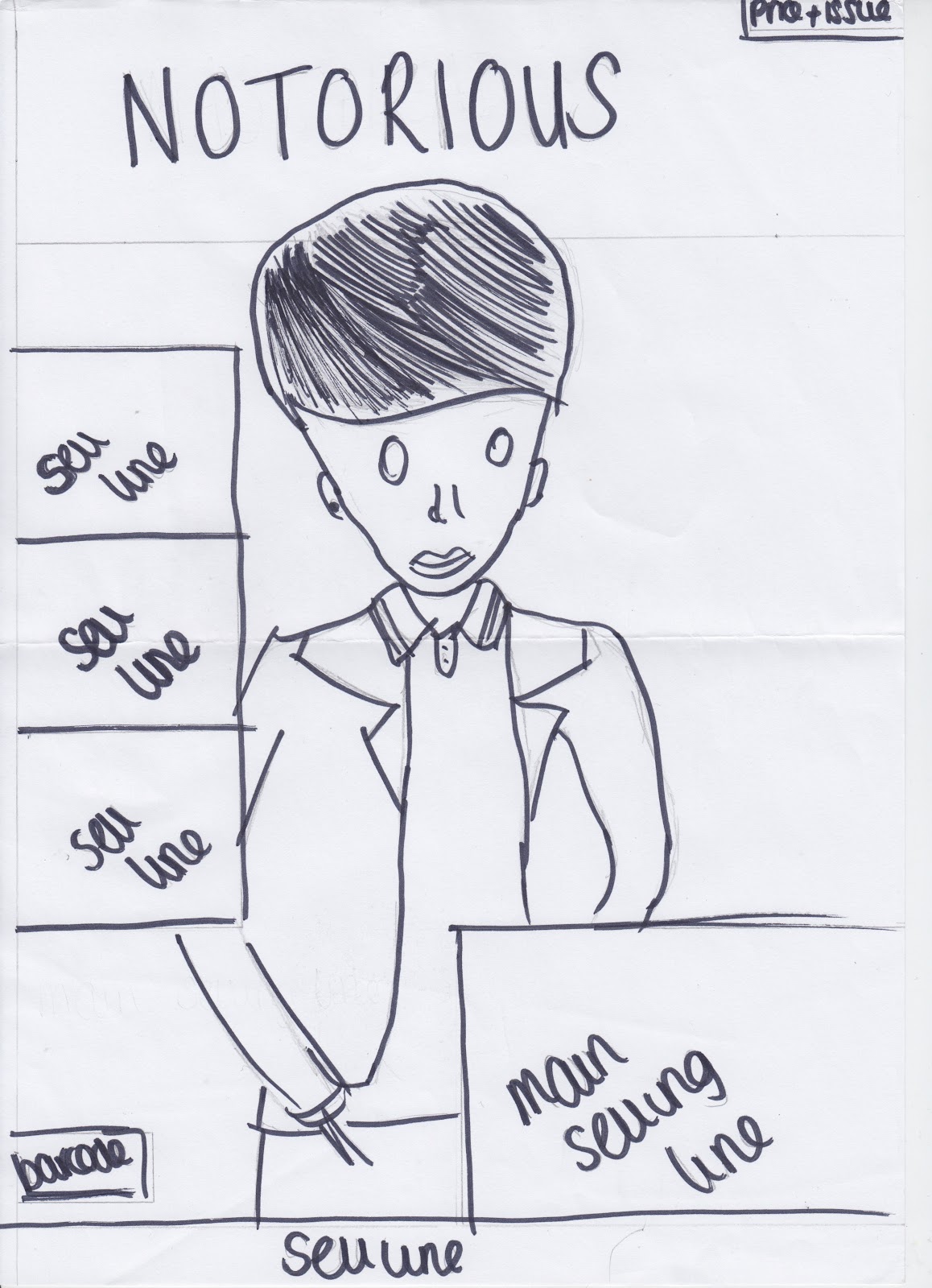
These are my flat plans for my magazine. They show how I would like my magazine to look like and be laid out like. For the cover, I would like for my main model to be centered in the page with the text laid on top of him. The masthead is positioned at the top of the page as it is the main bit of text on the page. The price and issue number will be positioned in the top right corner as it is not as important as the rest of the text found on the cover. The sell lines are found on the left as people tend to read from left to right, so therefore the consumer's eyes will be drawn to the text. The main selling line will be the same size text as the masthead as it is the main story and must grab attention. At the bottom is a sell line, which will give the possible consumers extra information on what they can find in my magazine. The barcode is positioned in the usual area; the bottom left-hand corner.
My contents page will be mainly images, as this is more interesting than reading lots of text. I plan to have an image of the band/artist featured in my magazine with the number of the page which they can be found on. My contents page will also have a list of the main stories and articles featured with the page numbers, and will also include a list of articles regularly featured with the page numbers. The date which the magazine has been issued will be faded behind the title "CONTENTS" as this looks quite professional.
My double page spread will be a large landscape image with my model in the left side and the text to the right. This is because people read from left to right and therefore the model will catch their attention first, and show the audience what the magazine is about. The title of the double page spread story will appear approximately head level with the model on the opposing page, with a summary of the article underneath, then the full story placed underneath.

 The horizontal guidelines are set to 0.5cm and 29.2cm. The vertical guidelines are set to 0.5cm and 20.5cm.